2016年2月17日星期三
Animate for beyond the words can tell
Animations and moving images that I saw when I was a little girl are the reasons for my choice of study in art and design since young. They are where I start to fall in love with art and music and kept inspiring me along the way.
I always find they unbelievably attractive, not like poems and novels, sometimes it doesn’t require words to connect to people’s mind, it appeals, relates and talks to people in a delicate yet direct way.
The Pioneer of Computer-generated Animations and moving image
John Whitney
The young John Whitney worked in the Lockheed Aircraft Factory during the World War 2 ( During the war, computer was invented as a tool to break Nazi’s code ) and while he was working with high-speed missile photography, he was technically adept enough to realize that the targeting elements in such weapons as bomb sites and anti-aircraft guns calculated trajectories and produced finely-controlled linear numerical equivalents, which could potentially be used for plotting graphics or guiding movements in peacetime artistic endeavors. A decade would pass before he was able to buy some of these analog computer mechanisms as "war-surplus" and construct with them his own "cam machine," which pioneered the concept of "motion control."
In the meantime, Whitney had made about two dozen films in more or less traditional animation. Among these were: in 8mm, a time-lapse of an eclipse and several drawn Variations, in 16mm two Film Exercises accompanied by electronic music composed by Whitney with a system of pendulums he had invented, and about 10 abstract musical visualizations using an oil-wipe instrument he had also invented as well as three 35mm cartoons for the UPA studios. He also did various commercial assignments including the title design for Hitchcock's feature Vertigo (in association with Saul Bass), and the preparation (in association with Charles Eames) of a seven-screen presentation for the Buckminster Fuller Dome in Moscow.
By 1960 Whitney prepared a sample reel of these and other effects he could produce, and solicited work for his Motion Graphics, Inc. company. His sample reel was artfully edited and ended with a lovely final image of a lissajous curve multiplied dozens of times, to appear twisting in waves, suggesting the time-lapse of a blossoming flower.The reel was released as Catalog and became a popular classic of 1960's psychedelica.
The current trends
The moving images and animations I have been watching recently has two main trends and they are so different from each other like from one end to another.
However, they do have one thing in common : the deep meanings of love, thoughts and philosophy of life behind those images.
One of them is rather dark, gothic and gloomy, like a poetry from Edgar Allan Poe, with that delicate sorrow and softness, it usually tells a story in a way of horror but left a deep thought about life.
My recent favorite: CHILDREN from Takuya Okada
There are too many words to choose to compliment Japanese Animation, those Fine emotional expression, detailed illustration, elegant exposition are the biggest characteristics of Japanese Animation.
Gothic but meaningful character illustrations ( Numbers on the forehead like products to represent the erased personalities, closed zipper as mouth like silencing the children’s voice) , gloomy background formed unique sarcasm to the modern society. As the music and sounds pushed the story to its climax, all the emotions and feelings burst out in a sudden, like shout to the audience to their face with thousands of words and tears.
Street.Of.Crocodiles:(Excerpt version)
The separation by robert morgan ( Highly recommend)
https://www.youtube.com/watch?v=NXKAlB6iYPg
The forest:
https://www.youtube.com/watch?v=rTXudHZM39Q
The other main trend of animation and moving images I have been watching is bright, clear with a pastel color.
Worth a look:
Squishy!
Who Lasts Longer by Zeinek Gehiago Iraun (Trailer) ( Please leave contact details if you want the full version)
https://www.youtube.com/watch?v=4_8967V5gYg
Death Buy lemonade by Kyu-Bum Lee
Chiruri "チルリ"
Zaha Hadid- entrance design
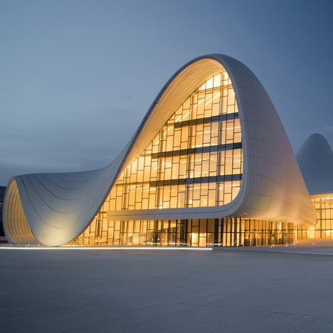
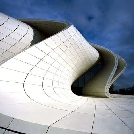
After researching and exploring Zaha Hadid's architecture deigns, I have selected Heydar Aliyev Center as a experiment project to create a entrance sign design.


"It's an architectural landscape where concepts of seamless spatial flow are made real – creating a whole new kind of civic space for the city," As Zaha Hadid said. This architecture is created with beautifully designed spatial flows, flawless, inspiring and elegant.
To match this architecture style, I decided to use curves and simplified alphabet letters for the same minimalism spirit.
Lost your way sir?
After watching the Zaha hadid's documentary recently, the task is to analyze and research environmental sign system.
Traffic sign
A traffic sign needs to be clear and sharp, extremely eye-catching for safety and directions.
That's why most of the traffic signs are either using vivid or contrast colors or in a massive size.

Commercial Sign
A commercial sign is aiming at introducing or promoting a specific store or brand, usually it involves graphic and typeface design to show the brand personality, a slogan to leave strong impressions, using delicate photography skills and smart ideas to draw audience's attention.

Safety Sign
A safety sign is for safety constructions, usually green light, commonly used in building construction area.

Way finding
A way finding sign will commonly be found in buildings or public area that serves as a guide or a pointer towards various facilities.
A way finding sign should be very clear and very easy to understand for its audience as it is a guidance for specific direction. Also when it sometimes appears as a building map, it should be detailed as possible.

Resouces from internet.
Thank you for reading.:)
Traffic sign
A traffic sign needs to be clear and sharp, extremely eye-catching for safety and directions.
That's why most of the traffic signs are either using vivid or contrast colors or in a massive size.
Commercial Sign
A commercial sign is aiming at introducing or promoting a specific store or brand, usually it involves graphic and typeface design to show the brand personality, a slogan to leave strong impressions, using delicate photography skills and smart ideas to draw audience's attention.
Safety Sign
A safety sign is for safety constructions, usually green light, commonly used in building construction area.
Way finding
A way finding sign will commonly be found in buildings or public area that serves as a guide or a pointer towards various facilities.
A way finding sign should be very clear and very easy to understand for its audience as it is a guidance for specific direction. Also when it sometimes appears as a building map, it should be detailed as possible.
Resouces from internet.
Thank you for reading.:)
订阅:
评论 (Atom)


